e-commerce:
PETS N’ STUFF SITE REDESIGN

how might we
allow people to support local business during the pandemic?
give customers peace of mind by minimizing their in-store shopping?
Pets N’ Stuff is a mom and pop pet shop in Lakewood, CO.
Customers need to be able to purchase online from the local pet shop so that they can get high quality items and save themselves from unnecessary trips and exposure to the public during the covid-19 pandemic. There is no current online purchasing option.
MY ROLE:
User Research, User Interviews, Journey Mapping, Sketching, Wireframing, Screen Flows, Visual Design, Mockups
WHO IS THIS FOR?
Those who have health concerns about having to shop in-store, but still want to be able to support the local economy
Those who love their pets like family and value the quality supplies and food that Pets N’ Stuff offers
Those who value convenience
What’s the current pet shopping landscape?
I compared Pets N’ Stuff to local competitors as well as well-known, national competitors. I wanted to see how they fared against both, and give them a competitive advantage in terms of overall design and features.


Current state of the website: cluttered and busy interface.
hand sketches
Before sketching, I considered the user flow to focus on specific page designs:
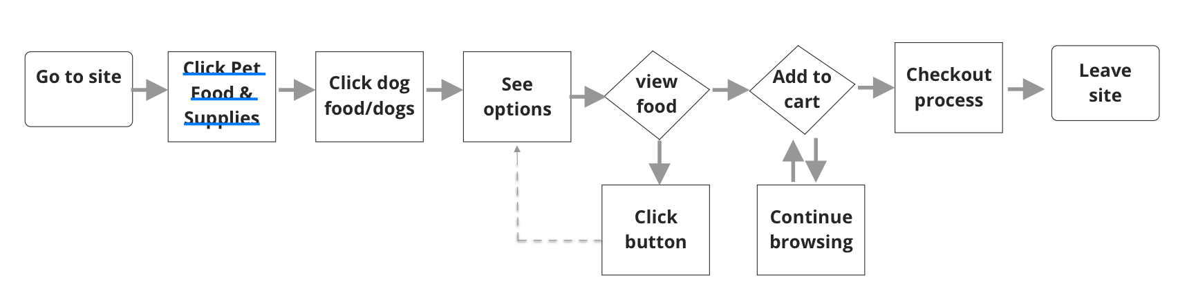
Ideas for the landing page
Ideas for other pages in the flow of purchasing dog food
wireframes

Landing page
Product detail page

Checkout page

Contact us page

Pet food & supplies overlay
About us page
See the full clickable prototype I used for testing here.
first iteration mockup
I tried keeping the original colors and went with my original design, but I ultimately decided it needed a refresh. I kept the original yellow but brightened up the green for a friendlier, more modern look.

what does the redesign look like?

New landing page. Simplified and clean user interface. Features carousel of deals, customer favorites up front to help shoppers easily find what they might be looking for. Large search bar is familiar to the e-commerce experience (Chewy, Petco, Amazon).

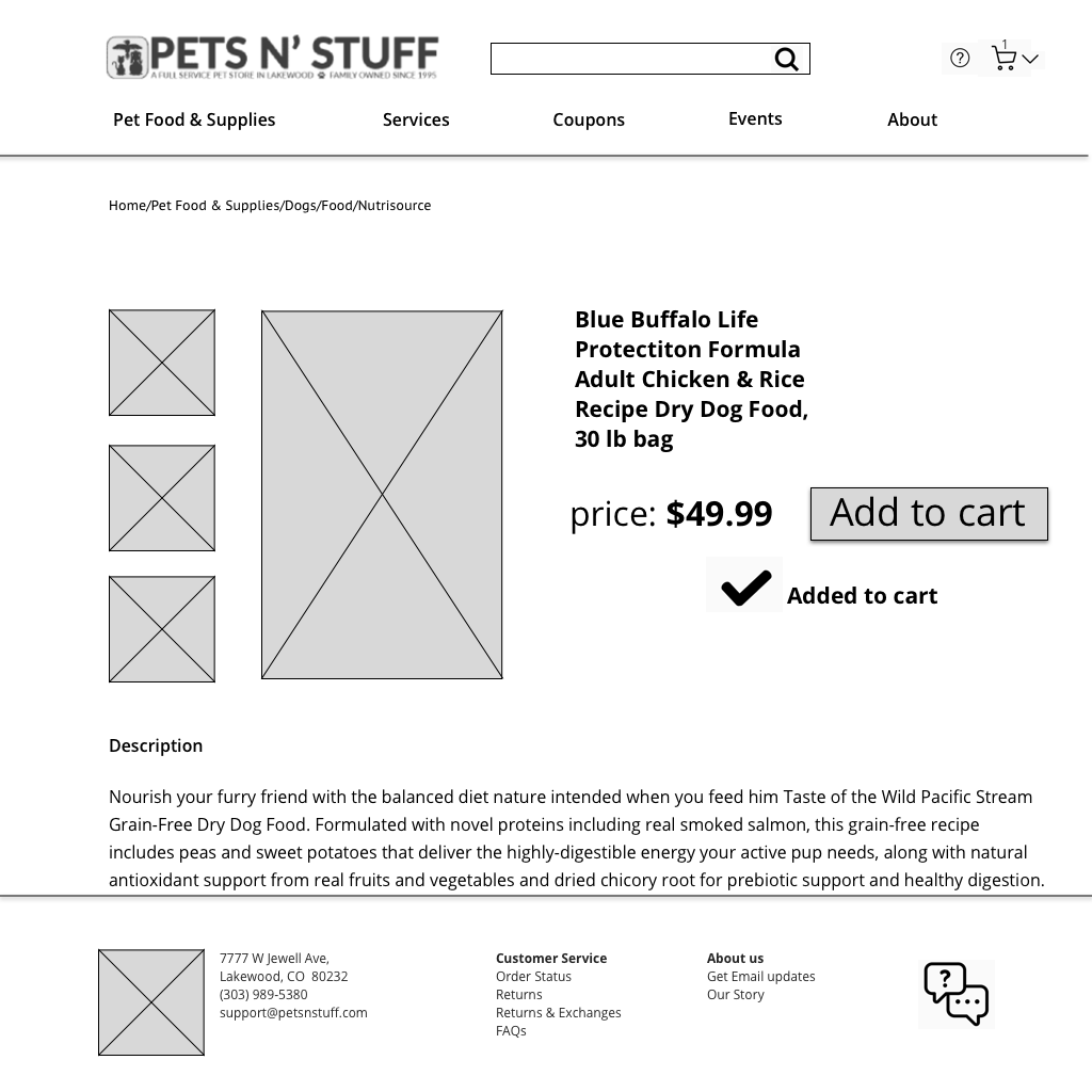
Product detail page features product description, detailed photos of the product, and ability to easily select desired size to add to shopping cart. Reviews are added as this is what competitors currently provide. Breadcrumbs are included to help user navigate site pages as they shop around.

Product detail page with cart overlay. Page is greyed out so that the cart overlay pops and draw’s shopper’s attention further. Shopper can easily click to proceed to checkout if desired, or can edit current items in the cart if they rethink an item.

All-in-one checkout page for seamless, quick purchasing process like competitors.

Mobile design consideration of the landing page. According to Forbes, mobile commerce is to increase by 68% by 2022.
LEARNINGS:
Pay attention to text size and where the eye is drawn. Hierarchy does matter and should be incorporated no matter what kind of site or app it is.
Utilizing common e-commerce practices is what is most familiar to people and therefore arguably, more usable.
NEXT STEPS:
Conduct more usability testing on the most recent iteration.
More comparative analysis to actively seek out more common practices and incorporate them into the prototype, then test some more. Continue to iterate.
Build out mobile experience.