
Redesigning Vitals Documentation to Support Safer Surgical Workflows
My role & impact: I was the sole designer on a scrum team tasked with rebuilding the surgical vitals experience. Through research with internal stakeholders and clinicians, I was able to increase documentation completeness and identified that ET CO2 was missing, an important indicator of respiratory status during anesthesia; I escalated this to the product manager for prioritization.
Timeline: ~4 months
Tools: Figma, FigJam, UX Tweak, Qualtrics
Team Make-up: Sole UX designer on a scrum team made up of 1 product manager, 1 engineering manager, and 5 developers.
Surgical nurses struggled to accurately record and compare patient vitals across surgical stages because the existing experience had inconsistent patterns and views, increasing the cognitive load during high-stakes moments in the OR.
I conducted an assessment of the existing experience and decided it was best to identify any patient safety issues first.
Auditing the legacy experience

Workflow observations showed what people did. Safety and clinician input showed why it mattered. Together, I was able to prioritize what needed fixing first.
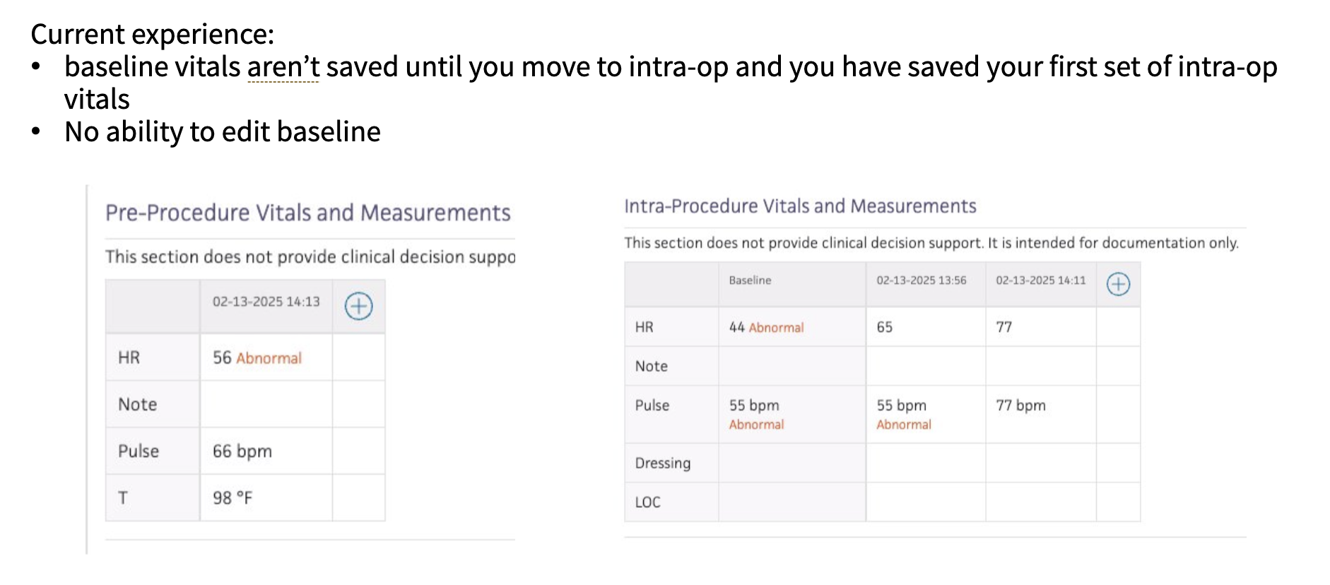
Critical data scattered: Essential ASC measurements lacked designated fields, forcing nurses to use generic notes sections
Baseline comparison barrier: Clinicians had no easy way to compare current vitals against baseline, which are crucial for discharge decisions
Navigation inefficiency: Accessing historical vitals required navigating across multiple stages
Inconsistent saving Unreliable data persistence created risk of information loss
I heard loud and clear that clinicians needed rapid access to baseline vitals across all workflow stages—critical for high-stakes moments.
I created a concept with a comparison view with color-coded stages for quick visual scanning, plus ad-hoc vitals logging and alerts for abnormal values.
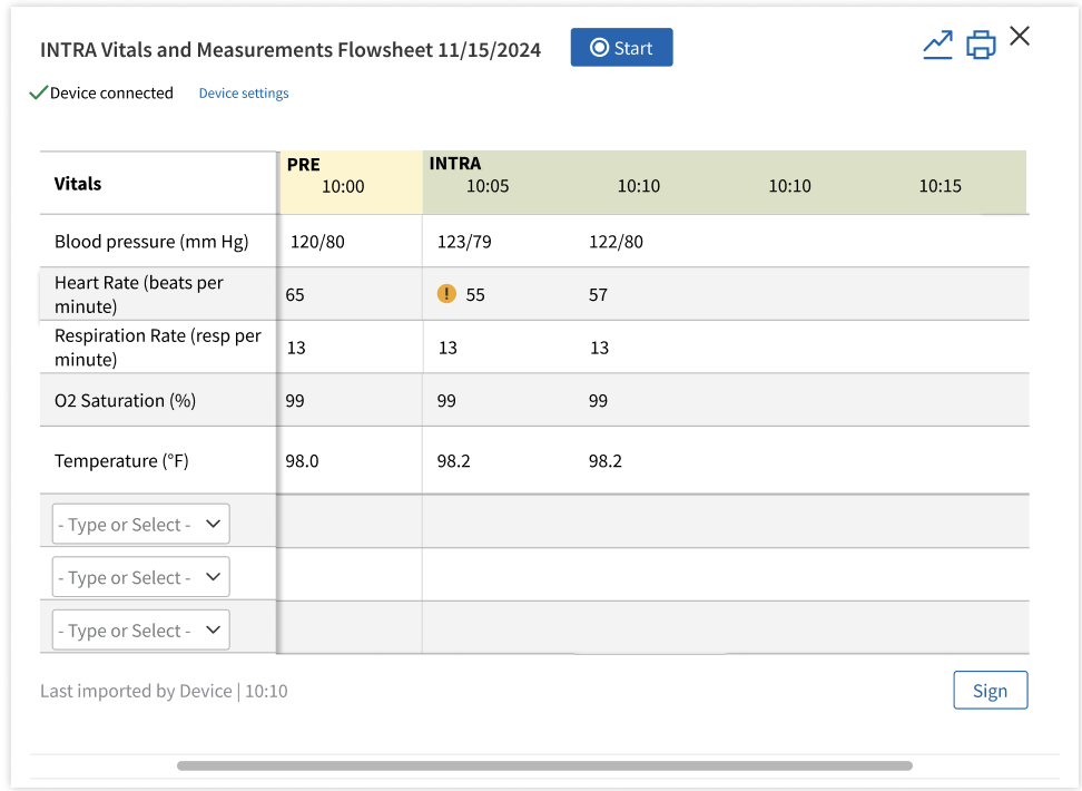
being able to add vitals on the fly didn't get very well vetted by feedback. It also was evident that the baseline vitals needed to be always visible vs. being able to scroll. The next iteration cleaned things up a bit with more discussion with internal clinicians. When it was close enough, I took the designs to usability testing.